The other day, Google’s homepage featured Raymond Loewy, designer of many things from locomotives to product packaging. Among his achievements was the Exxon logo. The following is from Raymond Loewy’s archives:
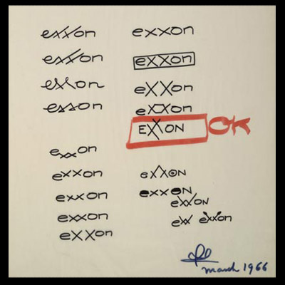
This got Bossy thinking about the many rejected logos, and what the future of the company may have been had they instead selected a logo from the discard pile. Shall we?


If you liked this post about companies, click here to read about the time a yoga pant company inadvertently produced crotchless panties.
Or click here for an episode of CNN Says, Bossy Says.
Or read this post about the time CNN reported a drop in NYC’s housing prices.
 Twisted Susan says
November 24, 2013 at 3:11 pmThis Thanksgiving Susan is thankful to see Bossy move up on her blog list.
 Meh says
November 25, 2013 at 12:19 amBump
 Charlie says
November 25, 2013 at 9:44 amI can imagine the IKEA instruction manuals…
Step 1: Assemble logo on box (Allen wrench not included).
 Chesapeake Bay Woman says
November 25, 2013 at 8:32 pmI still say Bossy should be writing/creating for SNL. I haven’t said it in a while, but I still say it.
 TracyontheRocks says
November 26, 2013 at 3:01 amHA!!! Ikea one had me cracking up!
 bossysMom says
November 26, 2013 at 12:34 pmI so agree with Ches Woman.
And you can’t believe what doesn’t make it to the written page….continually.
 Tom says
November 27, 2013 at 1:20 amYou need to post more often.
 Mollytopia says
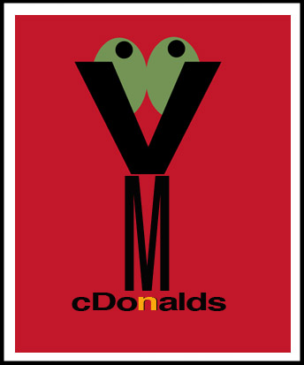
November 28, 2013 at 6:56 pmThe revised McDonalds one gets my vote, but mostly because it has olives.
 Elsewhere says
December 30, 2013 at 2:48 pmHappy New Year, Bossy. Can’t wait to hear your New Years resolutions!
love from Amsterdam
 Marinka says
January 4, 2014 at 8:02 pmI don’t understand why you don’t have a Pulitzer in Logo Design.
 Katie says
January 6, 2014 at 9:22 pmthese logos are so funny! check out the logo on standthesmartway.com. super cute. by women for women
 Martha says
January 9, 2014 at 11:51 pmI like the Gap one…it reminds me of
“Mind the Gap”
 Teresa says
January 18, 2014 at 2:52 amI love your Gap. Seriously, they should switch to that one, it’s so clever!
I also love your Ikea because it’s all too true.
 Stephanie Sheehan says
January 30, 2014 at 4:44 pmHaha those are cute! I like the creativity